
Free Range Logo Design
- Emma Louise Bell
- Mar 12, 2020
- 1 min read

Updated: Jun 23, 2020


Began this task looking at different colour pallets.
It was suggested that we began by looking at pastel tones as they were inviting.
I then decided to add a pop of colour to the mix to see what difference it made.
As you can see the colour pallet is very similar however a dark tone purple/blue colour was added to make it stand out.
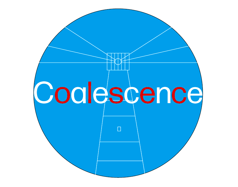
Looked further into what we should want our logo/ brand to look like. This is when I decided to base the design around Plymouth. With the key feature being the light house.
It made sense to emulate the colours of the lighthouse for a bigger impact.
I alternated the colours red and white in the letters to create a similar effect of the design of Plymouth's famous lighthouse.
I decided to round the logo design as it added a subtle hint towards the camera lens.
I played around with some brighter colours to make it more playful.
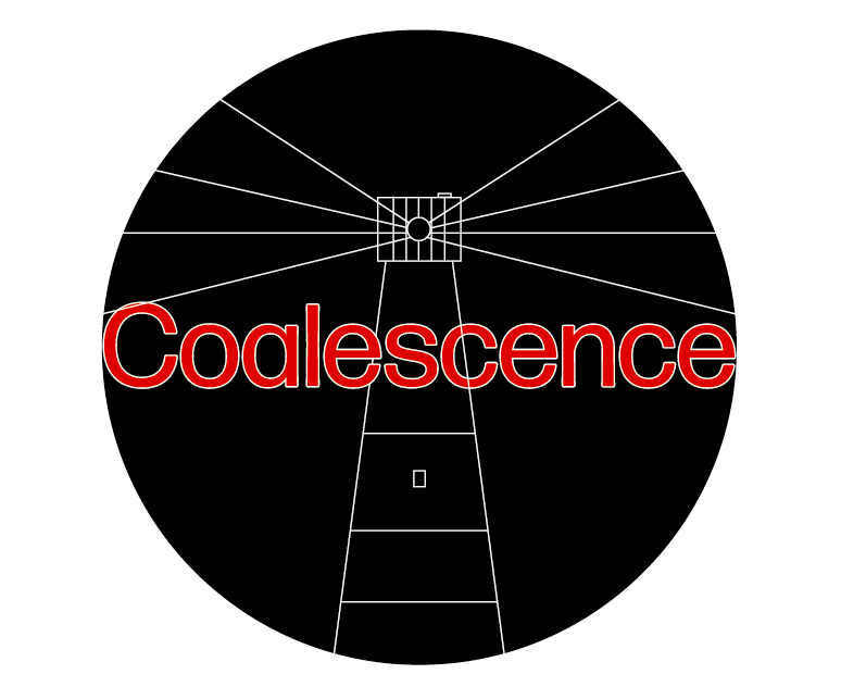
Here you can see the lighthouse design more clearly, however I thought that this took attention away from the name.
Based on some suggestions of my fellow design team I looked at a more subtle design.
We finally ended up deciding on this design as our final logo.
I added in more little subtle links to the photography side of us by making the light at the top of the lighthouse resemble a camera, adding in a shutter button at the top.

Comments